As I mentioned in an earlier post, I’m sifting through 40,000 image files and getting them ready to be posted to a new website platform for stock photography sales. It is a daunting task, but progress continues. The process includes deleting old, outdated files, limiting redundancy, and applying a full-level processing endeavor to all files, including the great nemesis of dust removal.
Why am I doing this…well, there are a number of reasons. My previous workflow, although efficient, was not well-suited to an automated image purchase environment. Previously, I made a photo look good in a web environment, then at the point of sale, would give it a full treatment of fine-tune processing, dust stamping, etc. Click and buy requires that this be done ahead of time.
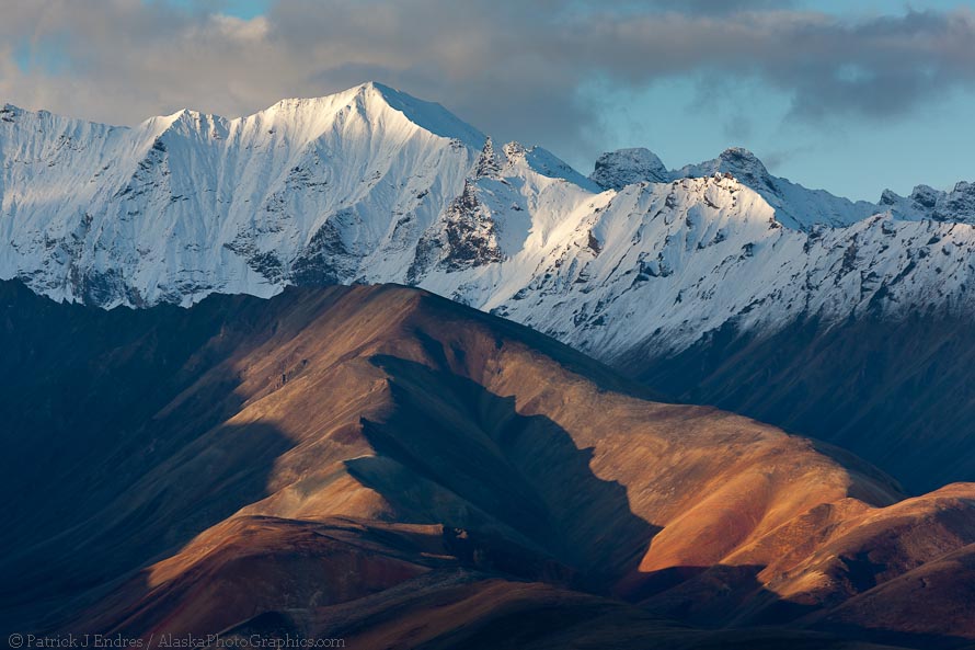
For those who are not interested in this workflow-geeky section, below is a pretty picture and you can bail after looking.

Morning light on Polychrome mountains, Denali National Park, Canon 1Ds Mark III, 100-400 f/5.6L IS, (275mm), 1/80 sec @ f/8, ISO 100
My LR workflow
Because some have asked me how I’m approaching this task, I decided to discuss briefly my workflow. One’s workflow is a personal system that evolves (with an emphasis on evolves!) based on the specific style of shooting and the desired end-use of the image. In my case, all images go to the web for purchase either as fine art prints or stock photography.
I’m going to jump past some of the basics of Light Room like the import process and meta date preset application and begin with how I edit a folder of pictures following a shoot. Let me also note that there are many different ways to approach this subject, and I’m sharing what works for me. I’ll also skip over the many shortcut keys that can really streamline the process, they are available within LR under the main menu, or you can reference this shortcut index
I’m open to contributing thoughts and ideas so please comment if you have other suggestions that work for you.
Survey mode
I’ll begin with a folder of 3,700 RAW images that I took in Denali Park in autumn of 2010. That’s a lot of photos. I use two, 30 inch Dell monitors, and the value of large monitors becomes increasingly more apparent in the editing process. A friend of mine in an IT department used to say two things about computers: “The brain is a terrible thing to waste” (in reference to slow and inefficient computer hardware) and, “USER ERROR” which was his response to me whenever I called for his help.
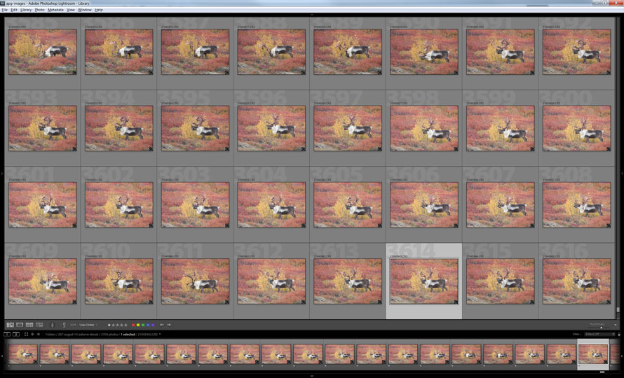
In LR I select the folder in library grid mode, collapse the left and right panels, but show the toolbar (“T”) and the bottom filmstrip bar.

Lightroom panel in grid or library view, showing thumbnails.
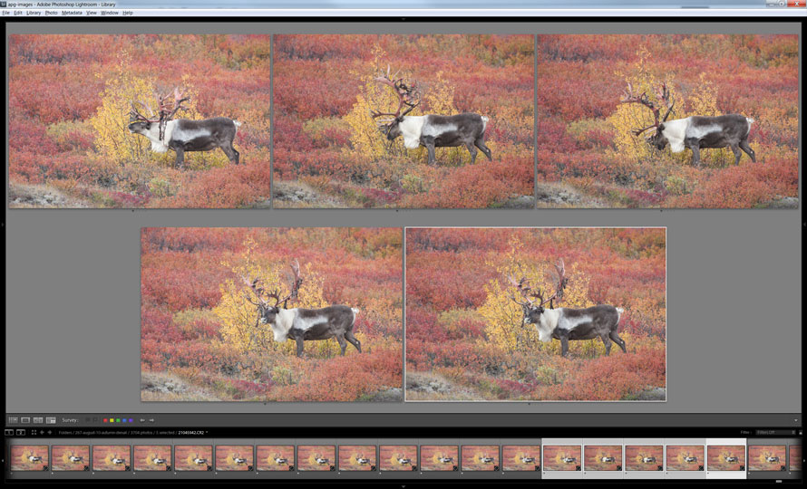
When I come across a series of very similar photos and want to narrow it down to just one or two keeps, some means of comparing is essential since it is impossible to remember them when toggling through at full screen res. So, I select a group in the film strip or grid and select “Survey” as a view option in the toolbar. All images are automatically arranged to fit the screen. I know the example image below looks small, but each thumbnail is about 8 inches wide, large enough to get a reasonable view.

Survey mode arranges all of the images selected in the filmstrip to fit on the screen. On a 30" monitor, these images are 8 inches wide.
While this view is helpful for evaluation, it does not reveal a 100% view to judge sharpness and focus. So a really cool option in Lightroom, (one that I’ve recently started using is “live loupe view”. The image below shows my two monitors side by side, the left monitor shows LR in survey mode, and the second monitor on the right reveals the “live-loupe-view”, along with a browser window for multitasking. Two thumbs up for lots of screen real estate.

Two 30 inch Dell Monitors, LR main panel on the left, live, loupe view on the right, along with a web browser open.
Activating Live-loupe
To activate the Loupe mode with dual monitors go to Window/Secondary display and select Loupe – live. Another dialogue box appears which can be re-sized to your liking. I make mine big enough to give a good view of the critical parts of the image at 100%. The “live” part of loup-live means that the dialogue box will display at 100%, whatever image you mouse over in survey mode. You don’t need to click, click, click, in and out of 100% view mode. Just mouse over and check for sharpness. There are other options to utilize a second monitor in LR, and they are worth exploring on your own.
Color Tags
At this point, I select the one image I like the most and color it red (red is my color code for keeps). If I come across of group of images that make a panorama stitch or post production blend, I color them blue. I only delete the really obvious, out of focus junk. I do that by tagging those yellow (my color for delete).
A note about deleting
What about deleting? Well, for me a delete image can be decided without needing to zoom in. If I’m zooming in to decide whether to delete or not, I’m wasting time. Hard drives are very cheap, don’t waste time dealing with the 90% that you don’t want, spend your time on the 10% keepers. Remember, the mind is a terrible thing to waste.
Once I complete the first round of edits, I select all the non-colored (gray) images and move them into a sub-folder called “outtakes”, I then select all the yellow colored images and move them into a sub-folder called “delete” (but I don’t delete them until later).
Then I make a second pass through the keeper images to make any refinements before beginning the process of applying LR processes in the development tab, and I’ll discuss that approach in the next post, as well as what I do with the outtakes folder when I’m all done processing or grading the files.


