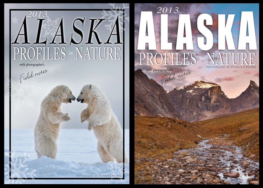
When the day came that I was asked to plan more than one year ahead of time, I thought: something has gone wrong. But some things are inevitable. As it turns out, before I’ve really hit the sales period for the new calendar I released this year, it’s time to get the next one to the printer. So I’m wondering if I can get a little help from my friends here in selecting the cover.
The calendar includes images from across the state, with photographic comments about the process of getting the picture. It is a mix of landscape and wildlife imagery. These are two that I’m considering.
From the perspective of a calendar sitting on a shelf (with a lot of other ones!) which one do you think would be the most eye catching?

Vote for what you think would be the most appealing calendar cover.
[poll id=”1″]
Thanks for taking a moment to vote.


