On average, I do a handful of assignments a year for Alaska Magazine. One of those, featured in the May 2009 issue, is about the community of Delta Junction, just 90 miles south of Fairbanks. Delta has an interesting history, dating from Alaska’s pioneer days, but of recent development as well, including agriculture and military influences. Kevin Coughlin wrote the article.
I thought I’d write a little about the making of the image used for the opening spread. As is typical with editorial features, the photography often happens well in advance of publication. In this case, I shot in Aug/Sept of 2008. It was an overcast day, which is generally appealing for portrait lighting, but sometimes challenging for the inclusion of a landscape. The strident challenge with location photography is to perform rapid assessment of both the subject and the environment and come up with a compelling composition while you dialogue and get acquainted with the person. Sometimes things fall together easily, sometimes not. Certainly, knowledge of the article’s content can help immensely, but that is not always available at the time of the shoot.

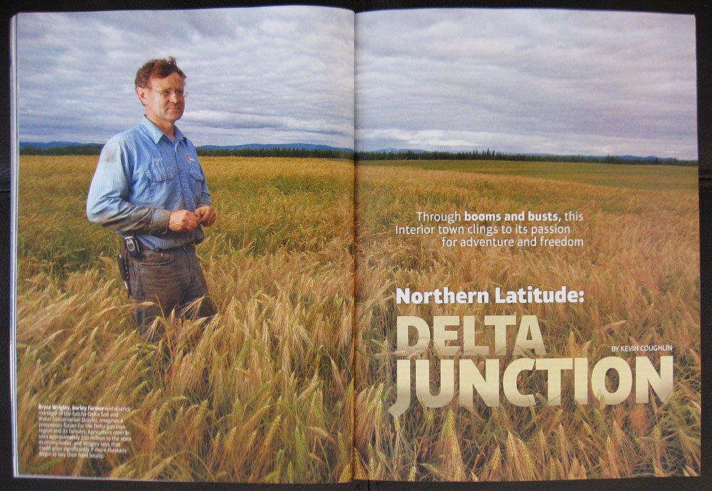
Opening spread in Alaska Magazine story on Delta Junction. Barley farm Bryce Wrigley, Delta Junction, Alaska. 16-35mm at (21mm) with soft box illuminating subject from left.

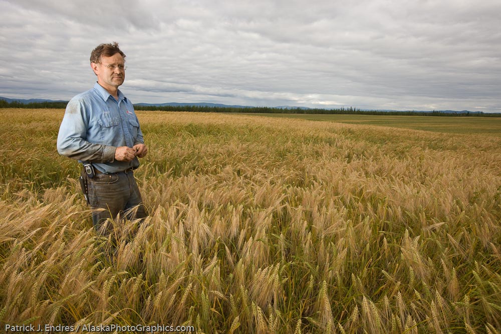
Original capture: Bryce Wrigley, Barley farmer in Delta Junction, Alaska.
In this case, Bryce Wrigley, a part time barley farmer in Delta drove me around his fields of ripening grain. I had him step into the field for a pose, feeling the setting appropriate for his portrait. The light was pretty blah, and to help with this I set up a small soft box just barely out of the frame, on his left side, in the general direction of the obscured sun. The flash was triggered remotely by a master on my camera. The added light really falls nicely on the subject and adds just what was lacking. I used a 16-35mm lens at 21mm, 1/100 sec @f9, ISO 200. The sky was slightly darkened with a brightness brush in Lightroom v2. The brush allows for non-global adjustments, in this case, to darken just the sky and not the subjects face as well.
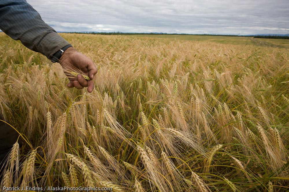
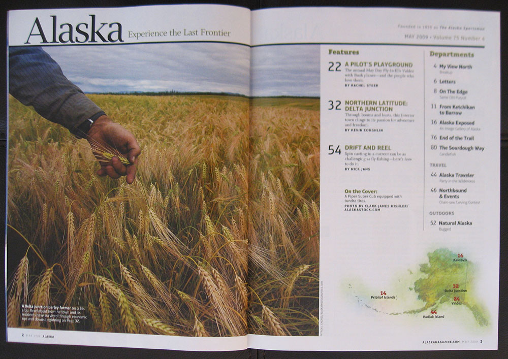
The “opening spread” image is generally a simple one, that leaves some room for introduction text. This is an important consideration to keep in mind when framing. I tend to shoot tight rather than loose, by habit, so it helps to envision the end use on the front side. Alternatively, getting a close up, tight shot, always rounds out a photo essay, and I shot some frames of the grains of barley, one of which was used for the intro table of contents page.

Original capture

Table of contents page. 16-35mm at (16mm) 1/100 sec @ f9, ISO 200


Patrick, Love these photos. Thanks for sharing. Greg
Hi Greg,
Just spent a few weeks in Prince William Sound, thus the delay. Fun time with Hugh, Ali, and many, many birds! I’ll be adding a few images from that trip soon.
Patrick