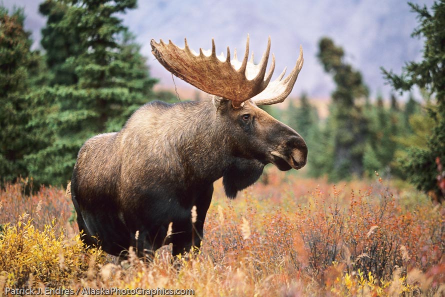
A decent stand alone photo of a bull moose. It lacks however the useful surrounding space that would make it a candidate for a wrap around cover, or two page opening spread. This frame is a keeper, but for some reason I did not back off and shoot more broadly. Perhaps the moment only lasted an instant. But giving a designer some options to work with will result in more stock photo sales.
I’m guilty of tight compositions. It’s a by-product of the school of thinking that frowns on cropping and feels that a single image needs to be self contained and compositionally defined when you push the shutter button. It’s a school of thought I no longer adhere to, but won’t get into that subject right now.
When I began nature photography, my sights we focused on beautiful scenes that would be candidates for fine art prints and Sierra club calendars. As the world of stock photography opened up to me I quickly became aware that there is one thing that art directors and graphic designers want, and need–and that is some space to work with.
My own background in the graphic arts and design told me this but it is different when you are behind a camera, and not at a desk working on layout. Additionally, this has been reinforced over the years through the photo requests that come through my stock website. But even still, I need to be constantly reminded and thus my digital specialist is always telling me to shoot wider.
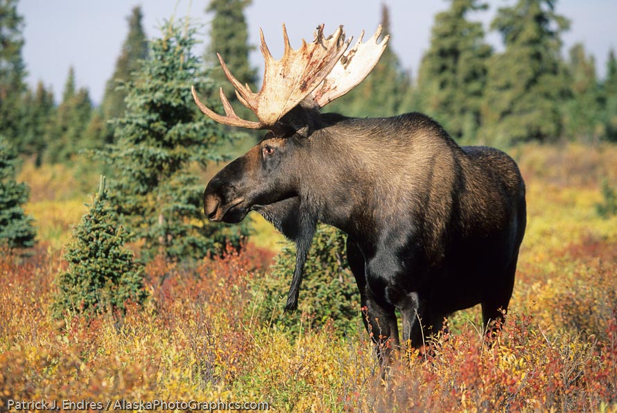
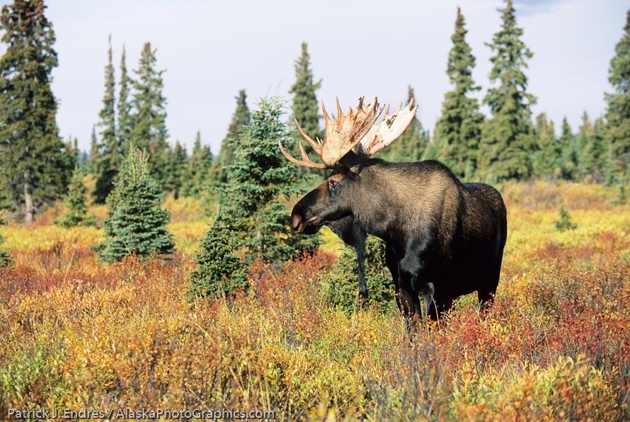
The case and point is illustrated in a photo request I received last week. A designer wanted a wrap around cover for a particular project and asked if I had any similars from the above bull moose shoot that provided more room. I dug through the files, but for any myriad of reasons, I did not. Those myriad of reasons could include: I just did not think to do so, I was shooting with a fixed focal lens, I had tunnel vision, the moment did not last long enough for multiple compositions, and so on. It served as an admonishment to keep in mind what the end purpose of a given photo subject is, or could be. The two photos below illustrate some variations in framing. But a cover wrap needs space to the left of the subject, which is not the typical “subject looking into the scene” type of composition. Shoot the subject in different ways! This is stock photography 101 but even after many years in the business, it is essential to keep the basics in mind.

Tight shot of a bull moose. A typical calendar type photo.

Backed off a little bit giving some room around the photo. More design options exist with this composition.


